Inclusive References: In Conversation with Andrew Kovacs
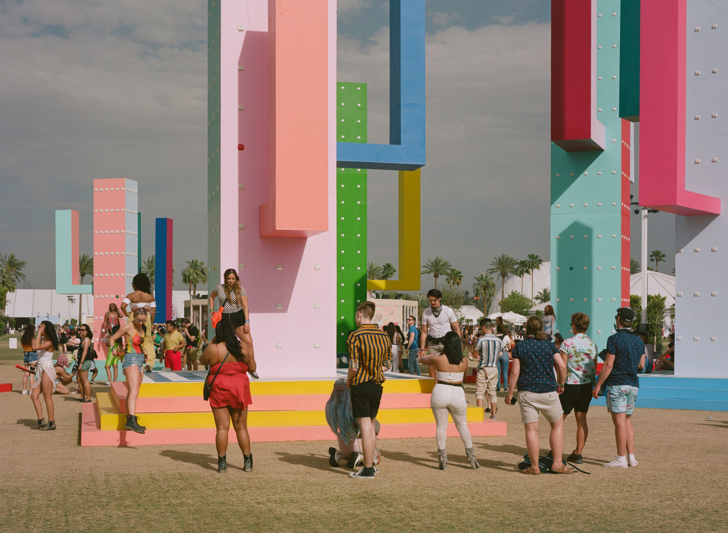
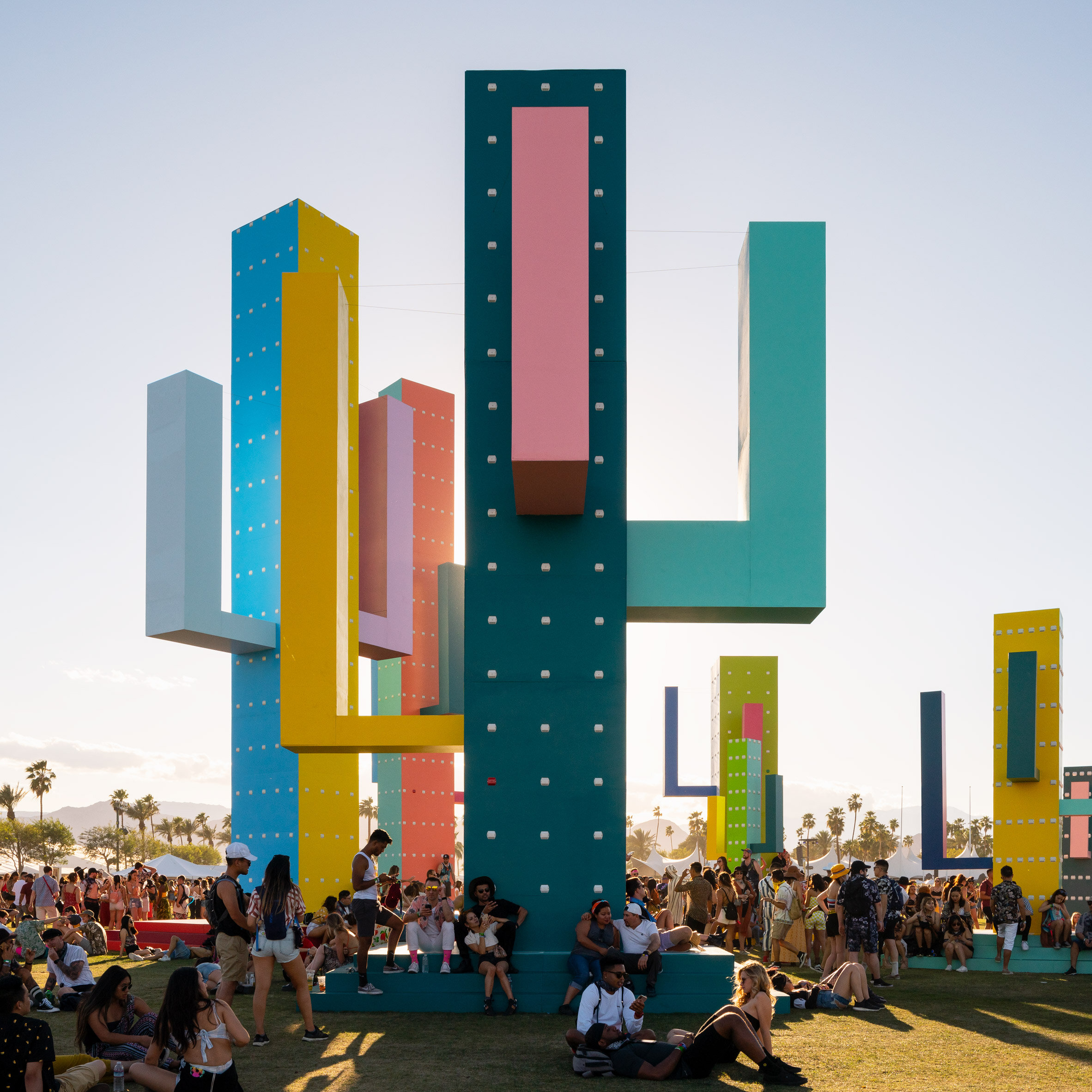
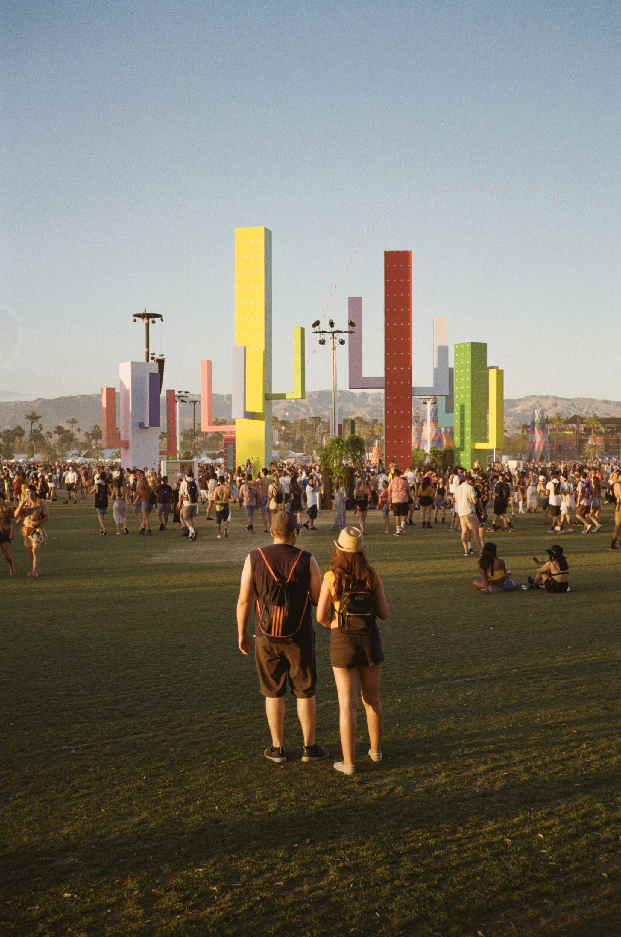
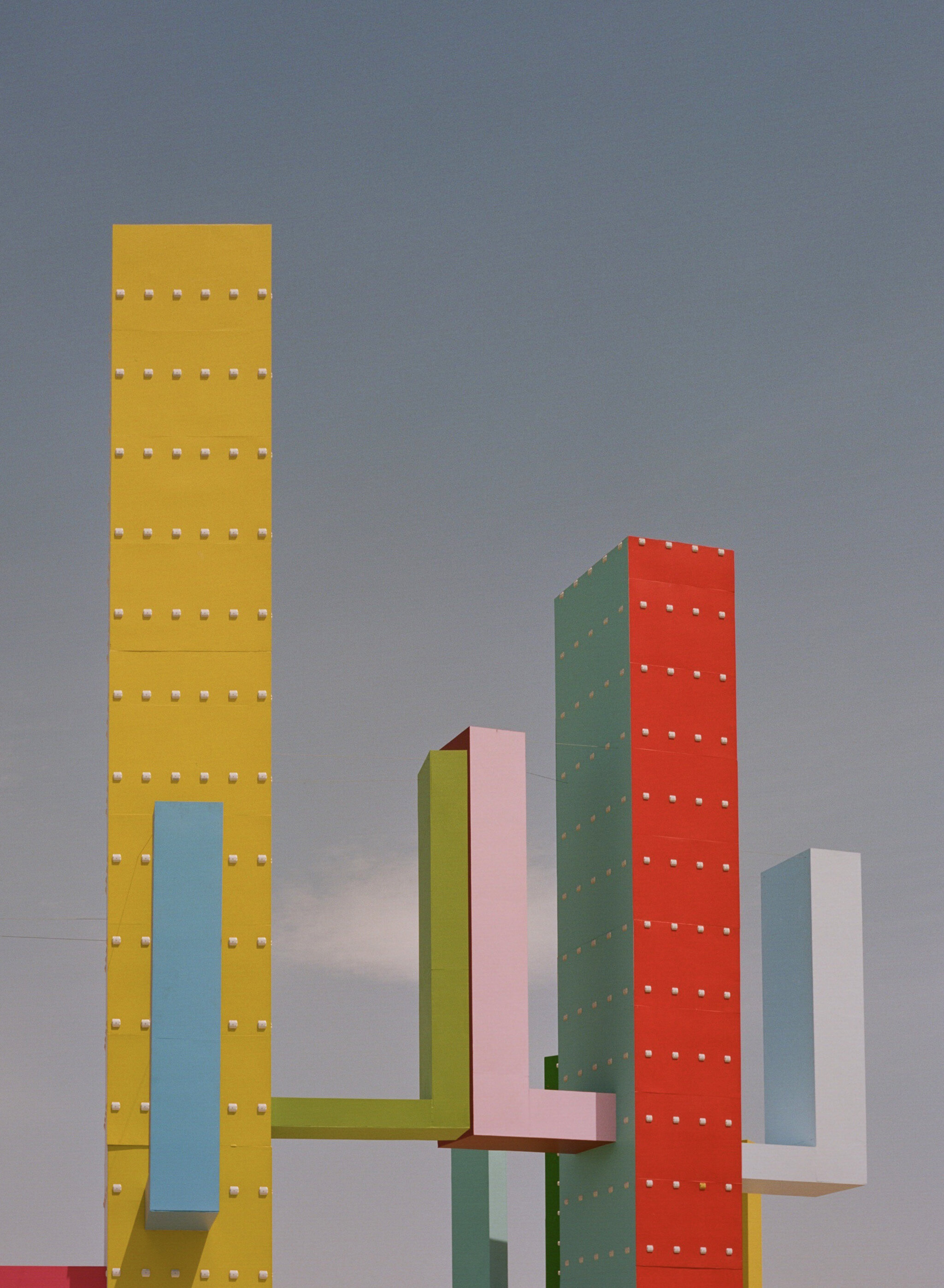
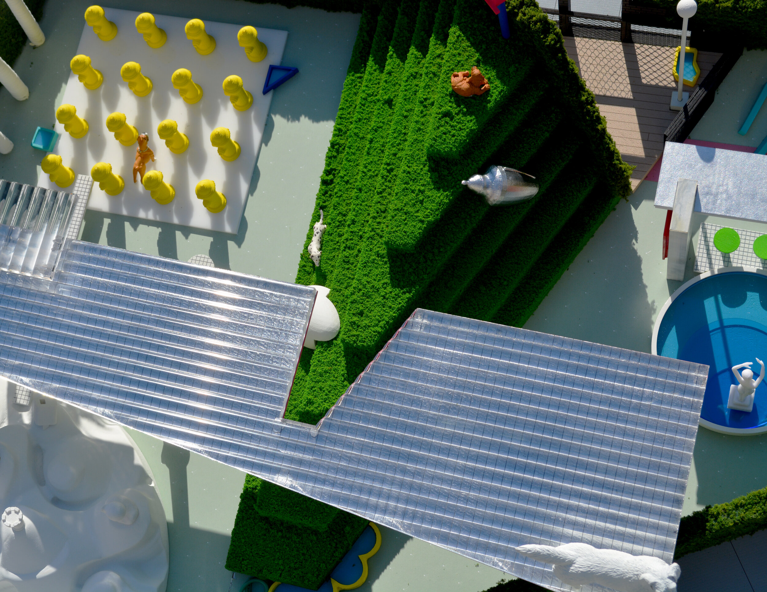
Coachella Colossal Cacti. Image courtesy Andrew Kovacs
Jimmy Bullis (JB): How important is style in your work, and do you value having consistency or a recognizable footprint? Is this quality of playfulness that we find in some of your work important in and of itself?
Andrew Kovacs (AK): I would say certain things may reappear in terms of thinking about style or themes. Things that might be seen as playful, or have an aspect of color or a kind of visual variety. And then, there are forms or shapes that appear that are recognizable to everyday people. I don't necessarily think so much about style but rather about having those types of things as ingredients in the work.
Lindsey Chambers (LC): To build off of that, are there any particular places where you really construct this palette? There is Archive of Affinities, but is there anywhere else that you think is distinct and where you draw reference or get inspired?
AK: I think Archive of Affinities—a project that records images—acts as a kind of reference library for my other projects. But also, I wrote a text in 2017 called “10 Locations to select artifacts,” which is written like a Yelp review where I would go collect things from places like the 99-cent store, eBay, Home Depot, craft stores, etc. So those places become important for sourcing materials. Sometimes you also find stuff on the street.
I'm always looking for things that I haven't seen, which is how Archive of Affinities started. I think there is a shift between collecting things and starting to produce things. I collect physical objects that become useful in physical models, and those models may serve different purposes; some might be made for an exhibition, some are made for fun, others are speculative, and some become models for a competition or an actual proposal.
JB: There's something nice about that impulse to go on a quest without knowing what the goal is, like going to the store looking for something without knowing what it is.
AK: I would compare it to persistence hunting, the phenomenon where in order to kill an animal you wouldn't use a weapon, but you would chase it until it would basically collapse from exhaustion. And I think about looking for stuff or materials in that way, whether for Archive of Affinities or material for physical models. Sometimes I would look for particular projects or architects, but most of the time, I was just randomly browsing—usually at the library once a week—and then collecting and scanning the things that I found appealing.
JB: How much of your model-making or collaging comes from a vision that you have ahead of time and how much of it involves exploration and active discovery through the process?
AK: The way we make the models is kind of freestyle, or free-form. But at the same time, some of the models have a larger thought-out or sketched-out idea in mind. This initial idea adjusts as the models are being produced.
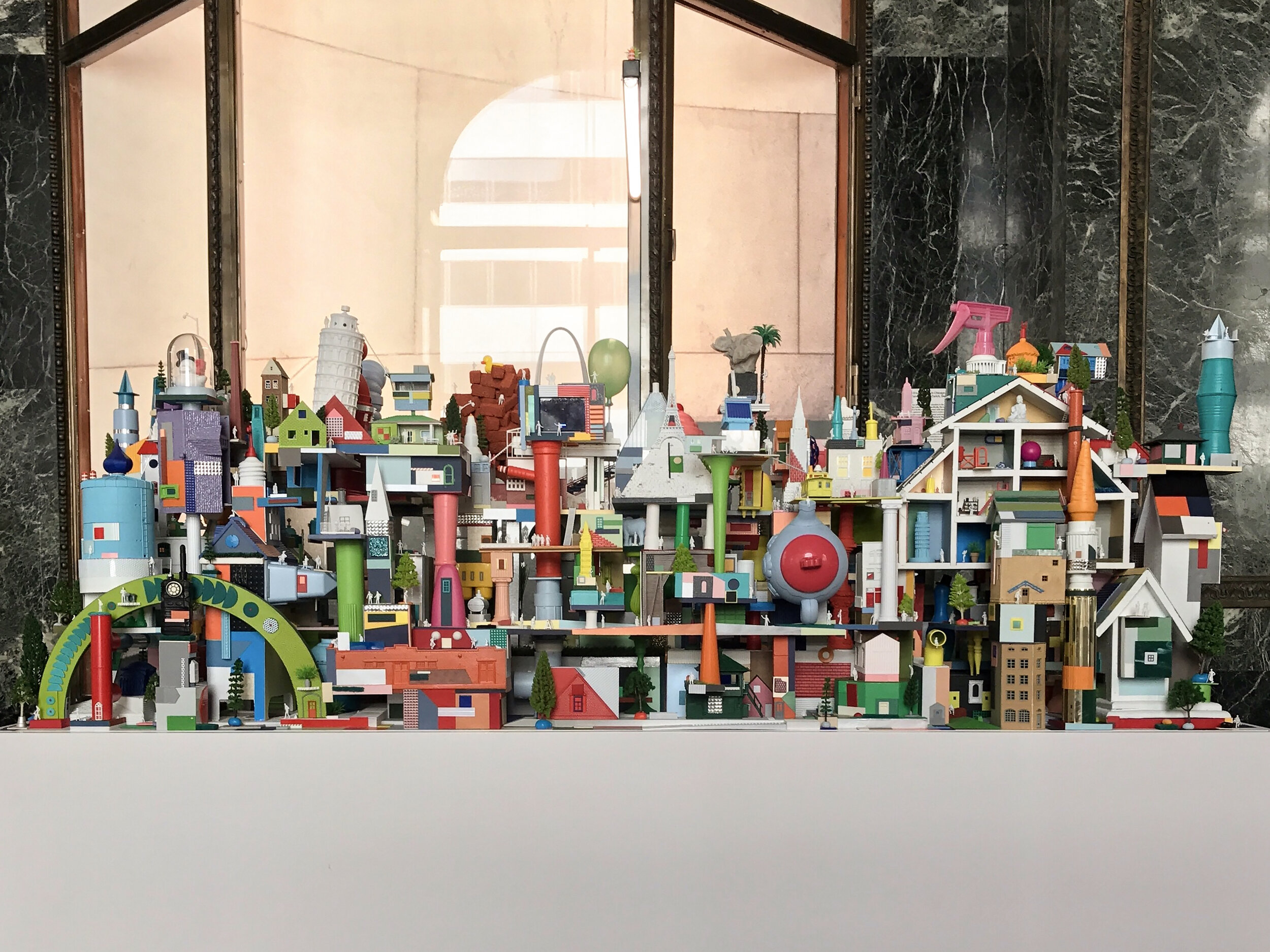
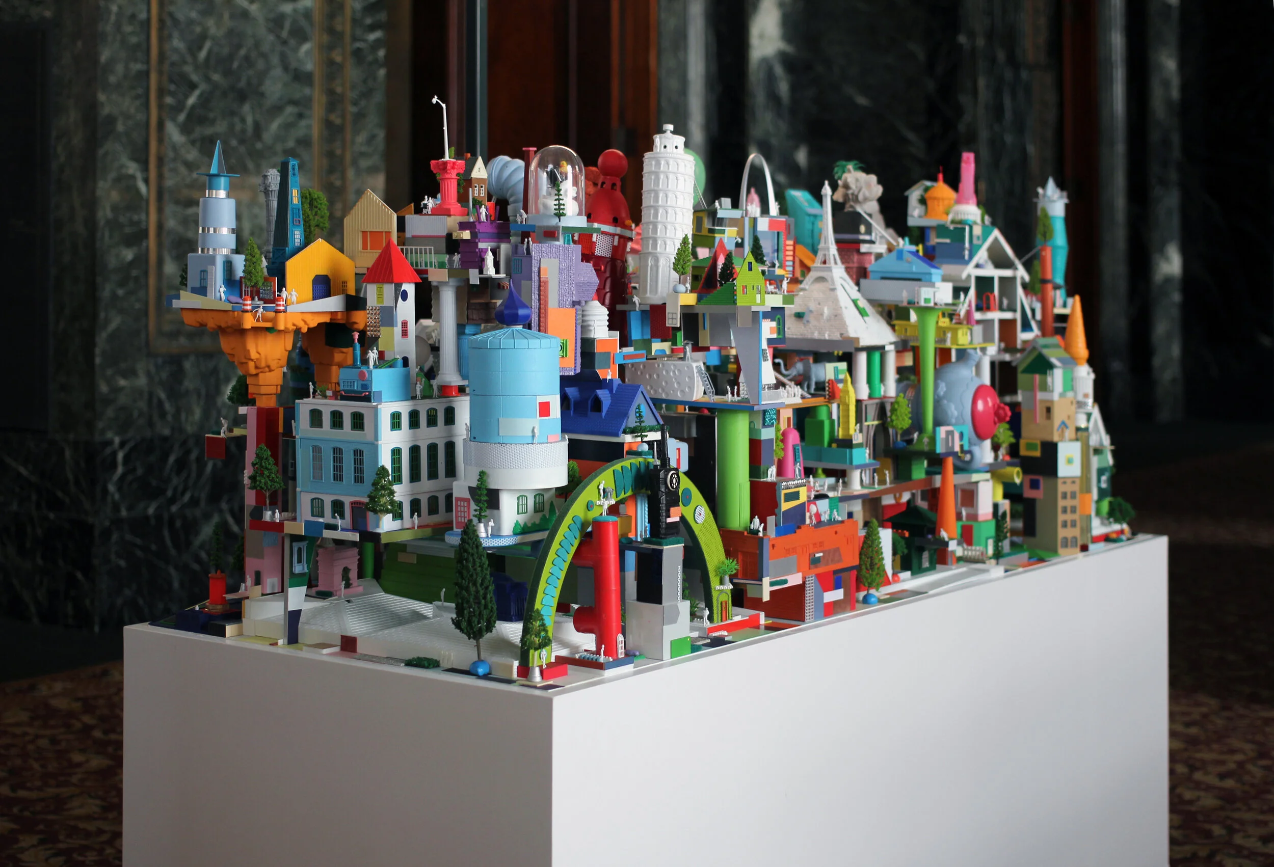
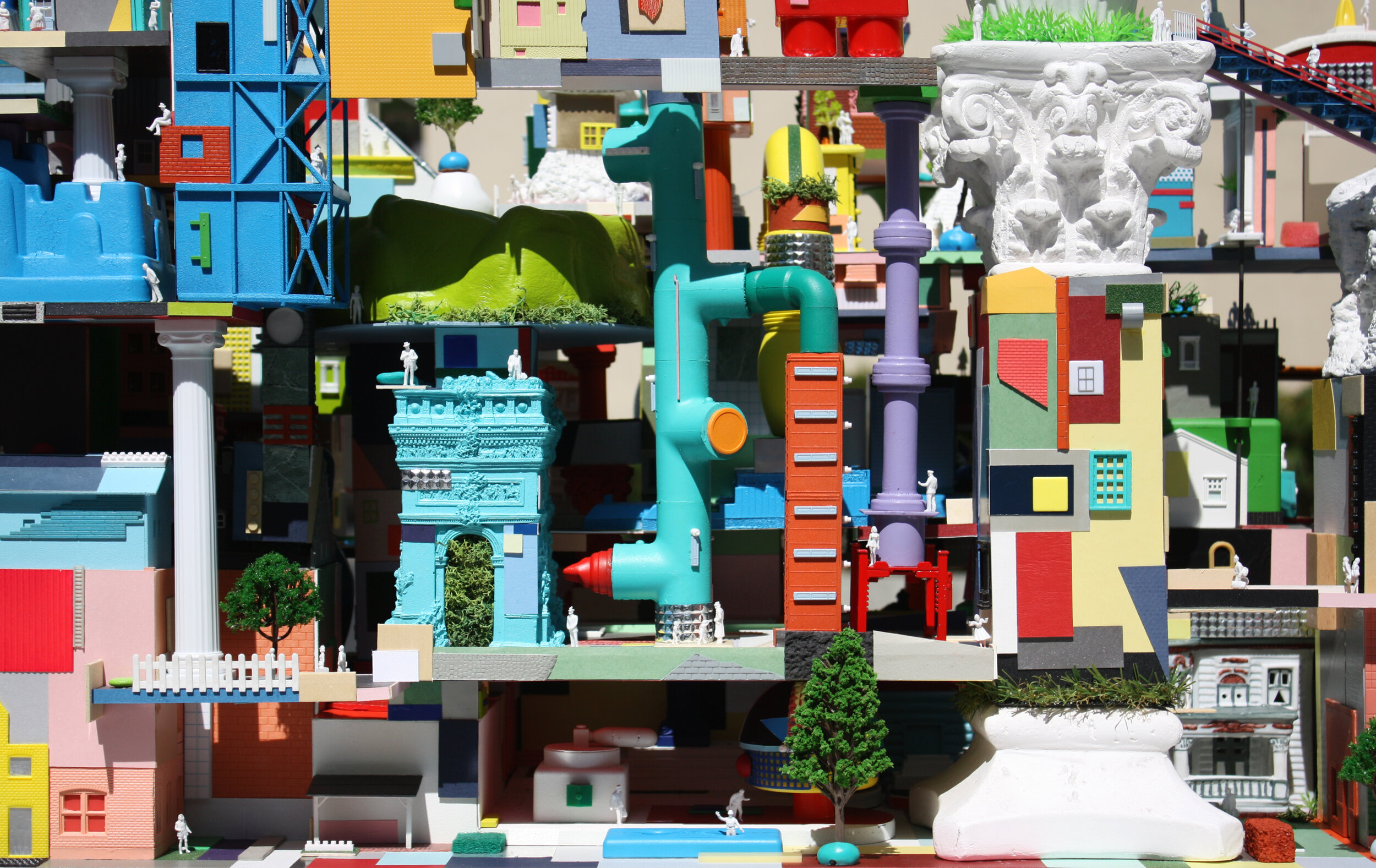
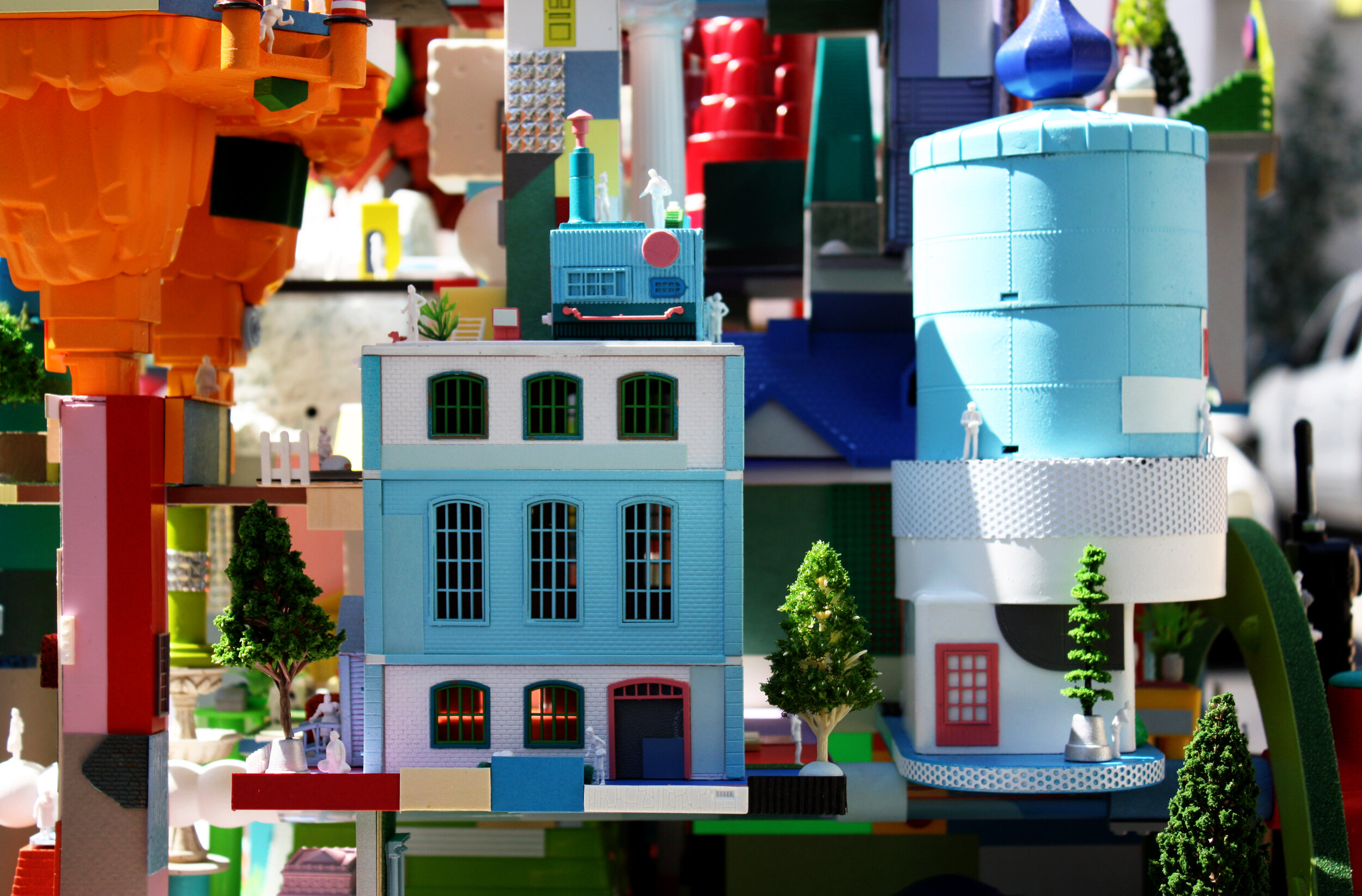
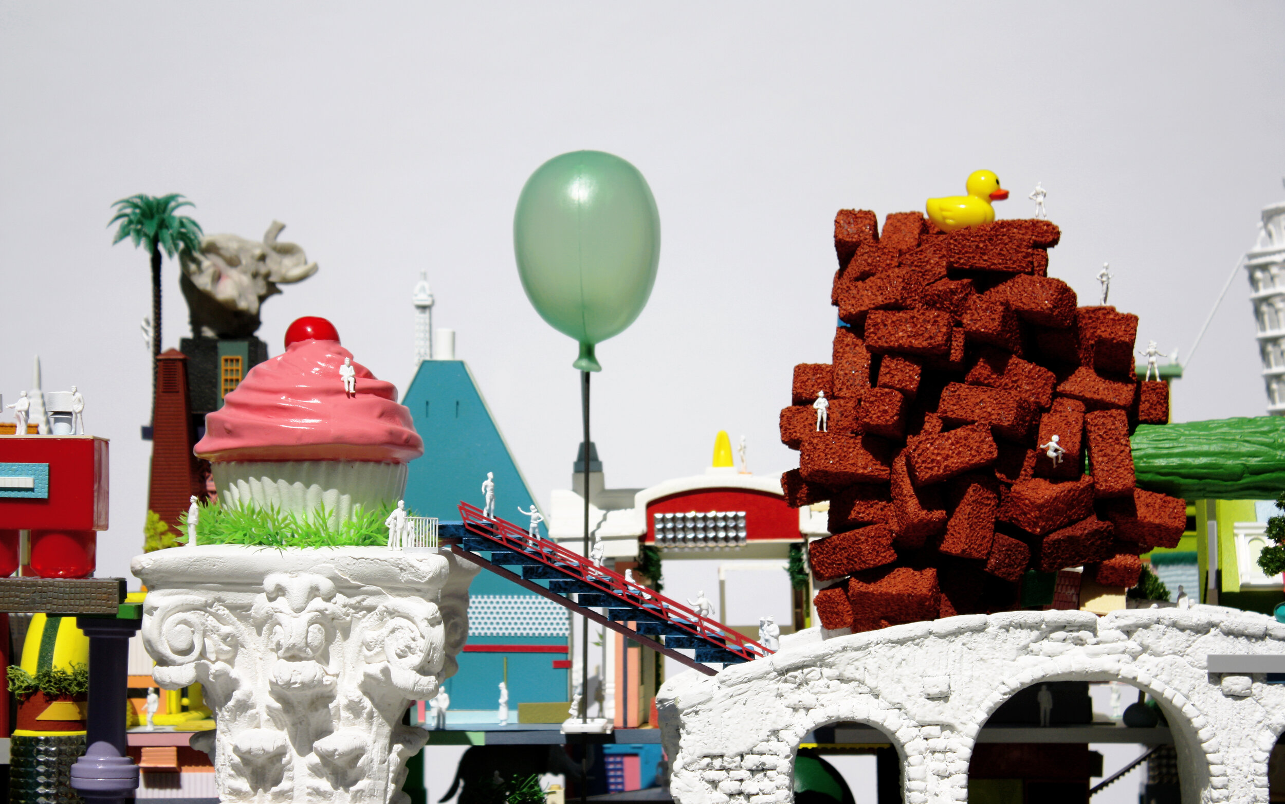
Pouya Khadem (PK): You use inexpensive ready-made materials as components for both your architectural thinking and for making models. There is a general understanding that models are a representational tool for the reality of the larger-scale built project. But if we, for example, scale your models into a very large project, those components will be custom and no longer ready-made. So to you, what is the role of the ready-made as a representational tool?
AK: I like this question, but this only would occur if you see it as a one-to-one literal translation. I think in the projects such as gallery installations, there is a possibility that they could become really expensive components, but there are ways to achieve similar effects with very low-budget everyday building materials. There are tricks and methods of designing to gain similar effects of models at the scale of a building. There is always an impulse to use ready-made and found objects; for instance, I use building elements like windows, which appear in the installations at Maple St. Construct, Omaha and at Woodbury University, or road reflectors, which replicate the spines of cacti in the Coachella project. I am not at the point where I have enough projects, or a project with a budget so large, that I could realize the ambitions of the more extreme models at a one-to-one scale. But, the building-like installations try to achieve the same effects of colorful density and diversity of different materials, etc.
LC: With your Archive, perhaps the process has changed over the last year because you couldn’t go to the library, but why is it so important that you take the images from print and then scan them digitally? What happens when you move them from their original context of the magazine and bring them into the digital realm?
AK: That's a great question. I don't know if it's important. I started Archive of Affinities in 2010 as a graduate student, back when the internet was very different from what it is today. One of the reasons I started the project was because I was interested in how people understood the discipline of architecture. I was looking for different projects—when someone would mention a project, you would then Google it because you don't know what it looks like, and often you would not find the project, or you'd find a low-resolution image of it, or it would be mislabeled because things on the internet may be put on there without enough care. But I knew I could go to the library and find the work that people may have been referencing. Coming from a book, I knew that the information would be accurate.
At the same time, I had a suspicion that many of the contemporary projects I was seeing by architects on websites like Dezeen were actually recycled from other projects in the past. You can see the influence of past structures like the spiral form for the new proposed Amazon headquarters building, for example. I was interested in creating a collection of types of projects; grouping things that obviously had an affinity with each other. Some are expected, like 25 square plans, and then some are weird—maybe weird is the wrong word –like a grouping of piles that are all horizontal in their proportion. I never set out to find horizontal piles, but after a certain quantity of images collected, I began to notice how across four projects from different artists in different time periods the horizontal pile appears. Square plans are easier to trace as there are plenty of square floor plans in the history of architecture, but horizontal piles are more unique..
I am not sure if it is important to scan or take things from the library, but in the process of browsing I come across far more; when you look for things on the internet there's less of a chance to stumble across something you are not expecting. I am not saying that it cannot happen, but I feel it is someone else’s suggestion for you: “if you like this, you might like this.” So it is difficult in that sense to just come across something on your own, totally by chance. In the library, through random persistence hunting and looking through different books and magazines, I come across things that I might not necessarily find otherwise.
Harish Krishnamoorthy (HK): When you started producing the Archive in 2010, social media platforms obviously existed, but especially in the past decade they've grown massively, and I'm just curious what your view is on them in the context of architecture. Do you think that people are exposed to more projects overall, or do you see it as only encouraging us to be visually biased and to just scroll through projects?
AK: I see social media platforms as just another tool for architects to use. I don't get too hung up on platforms like Instagram being visual; I like it, I'm okay with that, I like seeing the images. But to counter, there are other places that are maybe not as visual, like Clubhouse or Twitter. The question of endless scrolling is an interesting one, but perhaps it says more about the users, and how they choose to use or engage those various platforms. There are other ways to think about what the Archive would be like if the internet didn't exist, like collecting postcards, or slides, or maybe taking analog pictures.
HK: That comparison with physical media is really interesting to me. I wonder if you see something being gained from removing these images from the context of, say, a library book and putting them into this digital pool that's almost unsorted, and then for you to kind of dive into this sea of archived images?
AK: For me, it doesn’t really remove the context, but there’s a kind of evening out. The scanner is a flattening device; it's such a mundane office object, but also a tool that can be used not just for collection, but also to produce things. Scanning physical objects became a way to make collages.
LC: You’ve described how you're doing this yourself as some sort of a collective agent, where you choose between the things that come across your eyes. I wonder whether, in the future, you see the Archive of Affinities as a project where other people can contribute, or is this always going to be a personal project?
AK: At this point, it seems like it's always going to be a personal project. But I guess in a way everyone has their own Archive of Affinities. For me, it's just a way to look for things and generate my own sensibility, design tastes, and predilections. Sharing it on the internet was at first just a way to keep everything as a record. I think in the moments where the Archive slips into a production mode of making things, then there is obviously way more room for other people and collaborators to have input.
LC: I guess some of the benefits of it being a personal project are that there’s no client, there's no end date, it doesn't have a budget, you can do whatever you want with it. What do you see as the value of this, and over time how has the relationship between the Archive and its influence on some of your other projects evolved?
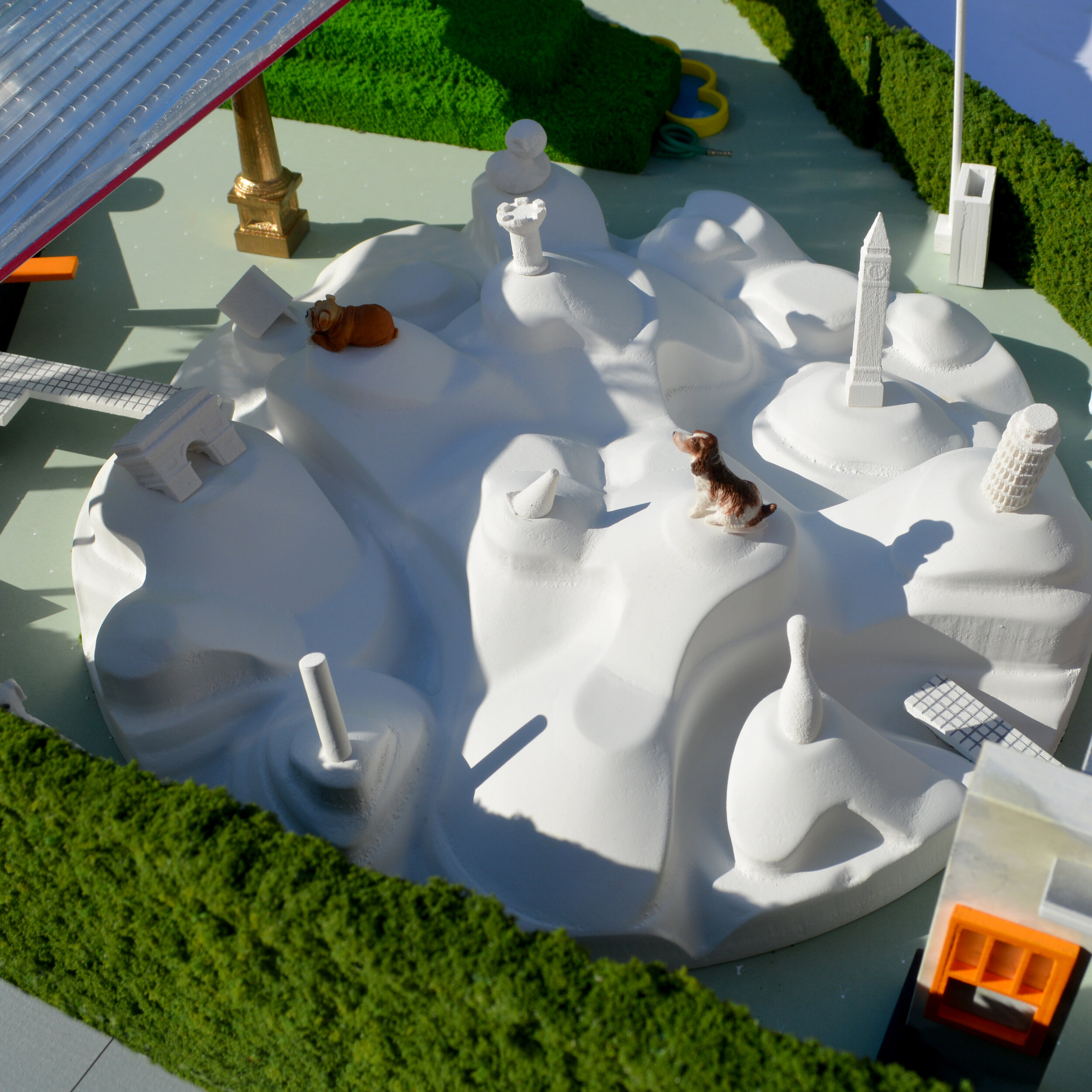
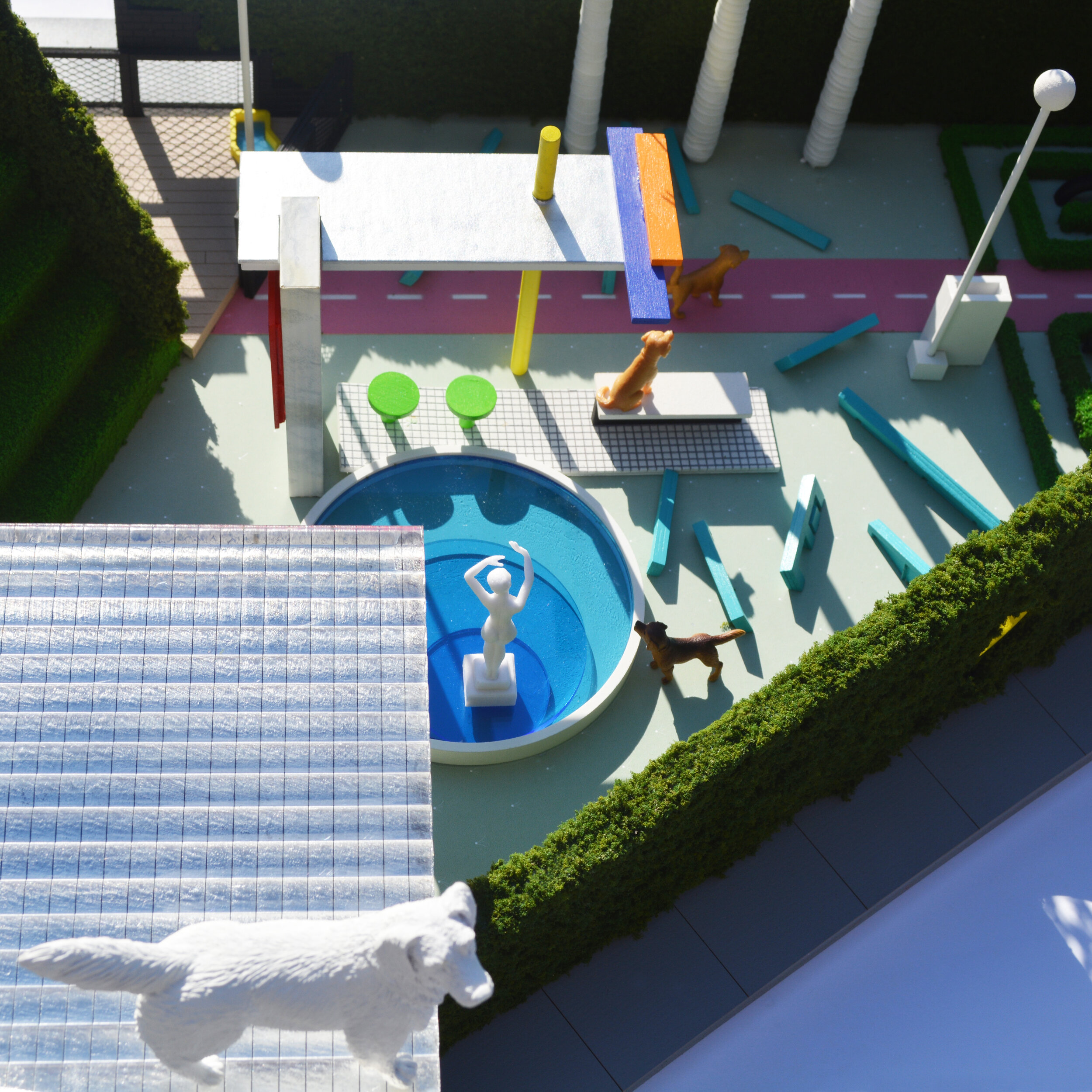
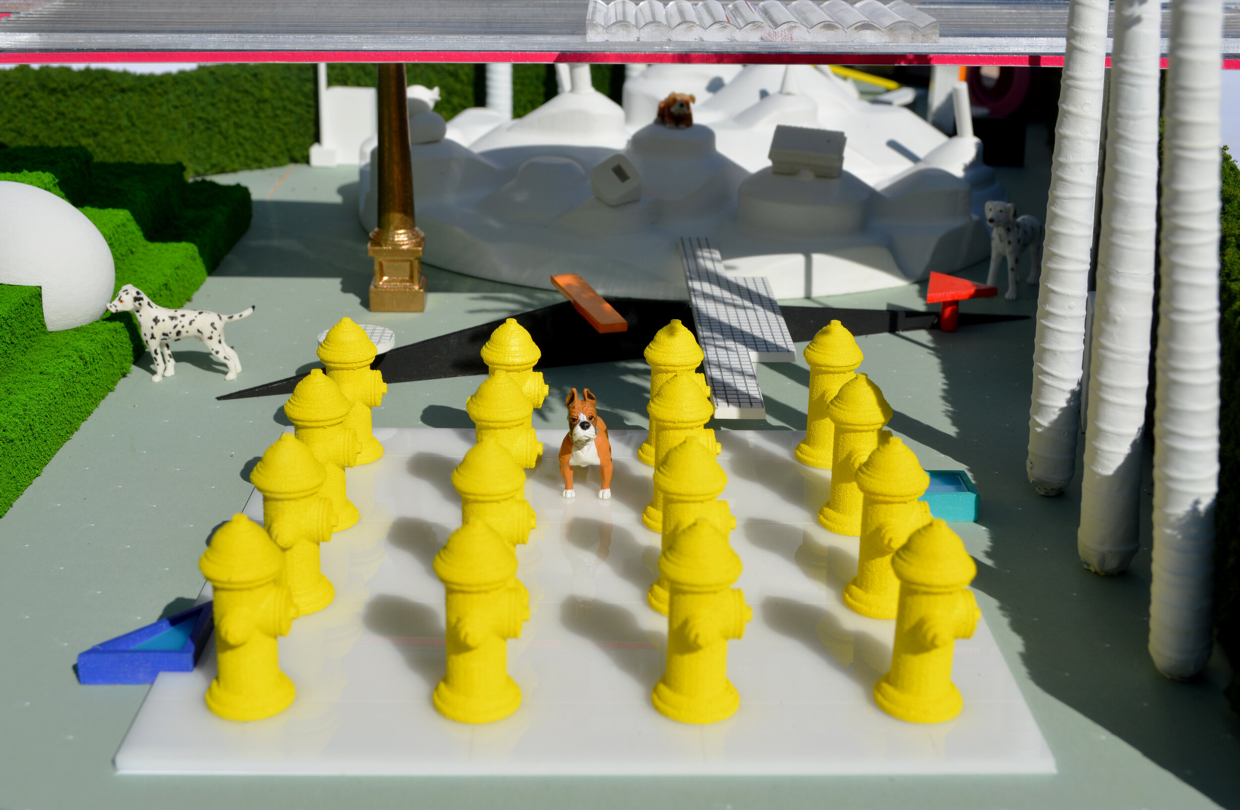
AK: The reason I say Archive of Affinities is a personal project is because the actual act of going and looking for things, scanning them, and uploading them is something I just do. Oftentimes, the Archive is used for other projects, and becomes this crucible that produces many different offshoots, which then become actual projects. Sometimes it really helps for gathering reference material, other times that material that's gathered actually becomes the base to make a collage or something different. For instance, I was once asked to design a dog park, and in the process of doing so, I would go to the library and look for images of projects that architects had designed for animals, like Cedric Price’s aviary. Ultimately, building the Archive just becomes a way for me to gather references that then become useful in thinking about other design projects. In a really simple way, it is like the concept of precedent, but for me there's not just ten precedents, there are millions. The more references, the better.
PK: Your work seems to emphasize the role of experience, for example having a cool experience, or a nice experience, or a strange experience—essentially an “adjective” plus “experience.” But at the same time, the elements or components of your models are symbolizing some sort of everyday life with the ready-made objects, and that makes those experiences more shareable between people. It's not just a one-to-one relationship: because of that general understanding of those symbols, it can be shareable. It reminds me of interactions with the work of, for example, Jeff Koons or Takashi Murakami, which might have some similar sensibilities. When you're designing, how do you deal with this tension of symbolism of a particular pop culture and universality, and by extension the tension of experience and individuality?
AK: The way I would start to think about it is by looking at a building like the Leaning Tower of Pisa. When people visit the Leaning Tower, you get this individual and collective experience with this structure that is ancient and old, but somehow when people pose with it they are being quite contemporary because they are uploading photos and selfies to social media platforms. I think this is exactly what you are talking about in terms of a shareable experience, and I kind of love that you mention the phrase “shareable experience.” I don't know if you heard about experiential marketing, in which shareable experiences are commodified or turned into commodities by capitalism. There are contemporary spaces that demonstrate this, like the Paul Smith wall in LA, or Urban Light by Chris Burden. I think really good public art produces experiences that are collective and shared, which can be as simple as just many people taking photos with it. I’m not sure you can always really design to have that happen—the person that designed the Leaning Tower didn't design it to fall down. Sometimes it happens by chance.
HK: Speaking of the public’s experience, I wonder, for you, how the concept of Leave Space resonates with your work and the Archive, where it seems that you are essentially relinquishing the control of the designer through using existing elements and collections of projects. Does this bring the architecture closer to people, closer to your audience?
AK: I am very curious to see your take on this concept of Leave Space. I wouldn't frame the way I'm thinking about it in those terms. For me, Leave Space suggests using existing elements, which is a little bit funny, because I think it annoys a lot of architects when they see something recognizable or not designed; it annoys them to think about the duck instead of the decorated shed. I find a little bit of an appeal in using ready-mades because I know it will frustrate other architects. But at the same time, the reason I really want to use things that are recognizable is because non-architect audiences might be able to engage with them. Another way I would frame the idea of Leave Space is to make things that welcome people and reach a broader audience.
HK: Perhaps I can reframe Leave Space in yet another way, which is that in your collection of different projects you're often bringing an eye to buildings and drawings that aren’t usually seen, or maybe are not part of our canon. In a sense, you’re giving a greater visibility to people and places and cultures that may not be so familiar. Do you see that as a kind of consideration that you take into your collection? Have you become kind of more cognizant of that as the Archive has grown?
AK: It goes back to how I was always looking for things I hadn't seen before. And perhaps it is not totally fair to say that the stuff that I share hasn't been seen before—I get them from books, so somebody had published it once before. But another way to think of the Archive of Affinities is to be inclusive to as many references as possible; to think about the work of people that were trained as architects but didn't work as architects, or the work of individuals outside of architecture approaching the subject. For example, I taught a studio in the fall of 2018, where we went with students to Bolivia to look at the work of Freddy Mamani Silvestre. I don't know if you know his work at all, but it's incredible, and he's so famous on the internet, but he doesn't have a website. He was really a good way to think about, say, the insider-ness—what we’re familiar with, the known, the “canon”—versus the outsider-ness—non-architects, non-conformists, the new—of the discipline of architecture.
JB: That’s a really good approach to thinking about the theme of this issue. We typically conceptualize the theme as leaving space in the center of something for people to come into, but in this way you are framing it as opening up the edges or the boundaries, which is really an infinitely expansive way to look at it, almost radically inclusive.
AK: Yes, that is how I would frame it. I would say if the discipline of architecture is like a center, I was always interested in things on the periphery, on the edge. Thinking about the theme through the idea of the edge is really great, and maybe the reason I am interested in the edge is that you could either expand or contract what you think of as the discipline of architecture.
JB: That’s wonderful, because the question is often raised about what architecture is, or how one can define it, and people have varying opinions on it. But inevitably it says more about you than it does about architecture, like where you draw the line, or maybe not even having a line.
AK: When I started the Archive in 2010, there was this notion of the canon of architecture. I don't know if you've seen this book by Peter Eisenman called Ten Canonical Buildings, I forget when that was published, but in 2010 it was still very present. I guess I was just interested in seeing more, wondering why we had to be so limiting as to what could constitute architecture and design, and how we could expand that thought in service of reaching a broader audience. I'm not interested in bringing people to architecture, but bringing architecture to the people. The built environment is sometimes terrible and boring; it’s just these beige boxes over and over again—here you buy food, here you buy shoes. Especially if you drive around a city like Houston with these big box stores, it's terrible. Does it really have to be like this, or can it be better? Maybe the way I’m thinking is naive; the way to make awesome architecture would be to have people that want to have awesome architecture. That begins by inspiring people that are not just architects, if that makes sense.
Andrew Kovacs is a Los Angeles-based architectural designer and educator. Kovacs’ work on architecture and urbanism has been published widely including A+U, Pidgin, Project, Pool, Perspecta, PLAT, Manifest, Metropolis, Clog, Domus, and The Real Review. Additionally, Kovacs is the creator and curator of Archive of Affinities, a widely viewed website devoted to the collection and display of architectural b-sides. In 2015, Kovacs published the book, Architectural Affinities as part of the Treatise series organized and sponsored by the Graham Foundation in Chicago.
